Thursday, March 27, 2014

HDR or RAW?

 The two images you see here are very similar. If you look very carefully the photo below has more detail in the front doors than the one to the left. If I keep looking at larger versions of the two I would probably find other places where a difference was visible. Still if I decided to print one very few people would be likely to notice much difference. The image below is HDR created from 5 separate exposures while the image to the left is is the middle exposure of the 5 adjusted in Lightroom.
Below is the Basic Panel in the Lightroom Develop Module. All of the horizontal sliders start in the middle with the exception of the first two which are automatically set to the white balance as the shot comes from the camera. So if you have set the white balance or if the camera has done it for you in the automatic mode that is how it is set. You may change it if you like but in this case I left it as it was. I did think the image was a little too bright so I adjusted the exposure by minus about 1/3 of a stop, which is the -0.36 you see.
The contrast slider was not moved at all and remains at zero. The next four sliders were where most of the work took place. Here I usually start from the bottom up with the Blacks slider. Hold the Alt key down and when you press the left mouse button on the slider the image turns solid white. Slide the Blacks slider to the left until tiny bits of black or color start to appear and then stop.

Use the same procedure for the White slider. When you hold the Alt key and press the left mouse button on the slider the image turns solid black. This time you will slide the slider to the right until tiny bits of white or color appear and then stop this control. You have now expanded the tones of the image so that you have pixels that are as black as possible and some that are pure white.

The next control is Shadows and for this no Alt key is used. As you slide the control to the right darker areas of the image lighten and as you can see I slid it as far as it would go for this shot.

The Highlight slider when slid to the left darkens only the brightest areas and here I again went all the way, this time to the left.

As I was making these edits I was comparing them to the HDR image I had created first and was attempting to make it as close as possible to that image. You would not be able to do this with all HDR images. The light to dark contrast in this image was not extreme to start with and the HDR image was adjusted to look realistic. HDR software can bend the tones of an image so that normal editing could not possibly duplicated. Most HDR users prefer to keep the images looking realistic. I sometimes go for an extreme look.

The HDR image was created from five images processed in Photomatix and the editing of the single image was done in Lightroom 5. Photoshop or Photoshop Elements and many others could have been used. In these editors the Levels control takes care of the Whites/Blacks settings and the Image>Adjustments>Shadows/Highlights does what the separate Shadows and Highlights control does here.

One thing to note is that the original image was RAW. RAW images contain much more tonal information than JPEG images and give you more range in the slider adjustment in both Lightroom and other editors.

As usual please comment, and questions are welcome.

Monday, February 17, 2014

Background Lighting Trick


First I do have a simple studio in my basement but what I've done here is a shortcut to a quick shot. We have some chairs we wanted to list on a local "furniture for sale" site and my wife asked me to get a shot of one of the chairs. The chair was already downstairs so I moved it to the studio end of the basement. I had just purchased an inexpensive flash diffuser, shown here, which I was experimenting with and it happened to be on the camera at the time. In my camera's program mode I just took a shot and this is what I got. The chair is sitting on a concrete floor and the painted concrete block wall is visible behind it. OK it shows the chair but this is my studio and I wanted a little better than this. Of course I didn't like the shadows either.
Sitting against the concrete block wall is a background stand that at the moment had a roll of black "seamless" on it (that's the wide roll of paper photographers use to create a smooth background). I wanted a white background but didn't want to take the time to change paper rolls so I was back to my grey painted wall. I pulled the chair a little farther away from the wall took my camera out of the program mode. My Nikon D700 will sync at 1/250th of a sec. but I set the camera at 1/200th to be on the safe side. I set the aperture at f/8 kicked up the ISO since I wasn't going to get much light from the new diffuser and fired a test, opened up to f/5.6 and shot again, not bad. The photo was pretty much back where I had started but in a manual mode. I have a small flash which is usually on a light stand with a 6 foot arm that will allow me to light from above. That flash has a sync which fires it when another flash goes off. Since it had no diffuser it was going to be a lot brighter than the flash on my camera. I raised it up and pointed it down aimed at the bottom of the wall. and set pretty low. Pop! 
The wall and the floor were over lit so there is no detail and no shadows. The grey wall and grey floor have turned bright white which is what I wanted. The shot you see here is what I got. If you want to set up a studio, an under lit background can be black, while the same background over lit becomes white, and lit normally it will look like what it really is. Don't start by spending a lot on backgrounds. I've collected quite a few over the years including black, white, blue, and grey paper. A grey/blue dyed wrinkled old bed sheet, and a grey painted 20' x 20' muslin drop usually used for shots of ballerinas who tend to spread arms and legs far enough to reach outside the limits of my 10' backgrounds.

Look again at the final photo for a moment. There is no visible bottom of the wall or edge of the floor. This is the effect that photographers get by using a roll of white "seamless" and pulling it down so that it curves smoothly and covers the wall behind and the floor under the item (or person) to be photographed. Here, just over lighting the background and spilling that light on to the floor I have created the effect of seamless in an unfinished basement.

Comments and questions of course are welcome.


Sunday, January 5, 2014

Photoshop Lightroom 5

The potential results of a combination of Lightroom 5 and a RAW image is nearly unbelievable.

Here is the original shot as it came from the camera, almost. The only edit was to straighten the horizon which was just a tiny bit tilted when I shot it. I shot using Aperture Preferred at f/11. What I wanted was a depth of field that would keep the image sharp from the grasses in the foreground to the horizon in the distance. f/11 would do that without causing diffraction problems. Stopping your lens down to it's smallest aperture (largest number) can create a lack of sharpness while a stop or so open from the smallest opening will allow a great depth of field without adding its own problems.

In one post I will not be able to do justice to what has happened in Lightroom but I will be able to give you an idea of what it is capable of and how easy it is to use. Look at the image to the left. First I'll go through the Basic Panel edits. No adjustments were made to the White Balance as it look good. The entire image looked a little over exposed so the exposure was dropped about 1/10 of a stop. Contrast was not adjusted. Highlights would normally be slid toward the left but because of a later adjustment were moved to +100. Shadows were left at 0. The White Slider was moved up to +62 to expand the brightness of the whites and the Black Slider to -62 to increase the richness of the deeper colors. The fact that those numbers are the same is purely coincidental. By holding the ALT key with the White Slider the screen turns black and the slider was pushed until the first specks of white appeared. Likewise holding the ALT key with the Black slider the screen turns white and the slider was pushed left until a few small areas of black appeared in the shadows along the edge of the grasses.


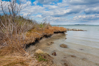
In the bottom section of the Basic Panel labeled Presence the Clarity was increased to +12 which enhances the apparent sharpness in the mid range of tones and gives the photo more "punch". The colors were somewhat flat and sliding the Vibrance Slicer right to +33 solved that problem. I don't often use the Saturation slider and didn't here.

Just above the Basic Panel is a small toolbar from which I selected the vertical rectangle which is the Graduated Filter. The mouse pointer becomes a small cross which I moved to just above the horizon line about 1/2 inch and click ad dragged it straight down until it was about 1/2 below the horizon. Any adjustments made now affect only the area above the horizon. A new series of sliders appear and I moved the exposure slicer to - 1.5 stops to darken and enrich the sky and clouds.

This created a new problem. Since some of the grasses are above the horizon line they also got darkened and did not look realistic. This time from the toolbar I selected the last tool to the right, the Adjustment Brush. With it I painted the grass area that had been over darkened and with the sliders which appeared above the Basic Panel I adjusted the Exposure to + 1.5 stops which undid the unwanted -1.5 stops that was done by the Graduated Filter.

In this image no Tone Curve, HSL, or Split Toning were applied. Frequently HSL is a great help to the sky but we'll save that for another post.

In the Detail Panel only two adjustments were made. The amount was moved to 75 and the Luminance was set to 50. One final adjustment, which I usually make first, is in the Lens Correction panel. Place a check-mark in the Enable Profile Corrections box and one in the Remove Chromatic Aberration box.

That's it! The total time was less than 10 min. probably closer to 5. Of course it will take longer the first few times but I hope you like the looks of the corrections. I did go even further and in a later post I'll pick up where I left off and make a few more changes.

Comments and questions are welcome as always.