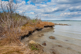
Here is the original shot as it came from the camera, almost. The only edit was to straighten the horizon which was just a tiny bit tilted when I shot it. I shot using Aperture Preferred at f/11. What I wanted was a depth of field that would keep the image sharp from the grasses in the foreground to the horizon in the distance. f/11 would do that without causing diffraction problems. Stopping your lens down to it's smallest aperture (largest number) can create a lack of sharpness while a stop or so open from the smallest opening will allow a great depth of field without adding its own problems.
In one post I will not be able to do justice to what has happened in Lightroom but I will be able to give you an idea of what it is capable of and how easy it is to use. Look at the image to the left. First I'll go through the Basic Panel edits. No adjustments were made to the White Balance as it look good. The entire image looked a little over exposed so the exposure was dropped about 1/10 of a stop. Contrast was not adjusted. Highlights would normally be slid toward the left but because of a later adjustment were moved to +100. Shadows were left at 0. The White Slider was moved up to +62 to expand the brightness of the whites and the Black Slider to -62 to increase the richness of the deeper colors. The fact that those numbers are the same is purely coincidental. By holding the ALT key with the White Slider the screen turns black and the slider was pushed until the first specks of white appeared. Likewise holding the ALT key with the Black slider the screen turns white and the slider was pushed left until a few small areas of black appeared in the shadows along the edge of the grasses.

In the bottom section of the Basic Panel labeled Presence the Clarity was increased to +12 which enhances the apparent sharpness in the mid range of tones and gives the photo more "punch". The colors were somewhat flat and sliding the Vibrance Slicer right to +33 solved that problem. I don't often use the Saturation slider and didn't here.
Just above the Basic Panel is a small toolbar from which I selected the vertical rectangle which is the Graduated Filter. The mouse pointer becomes a small cross which I moved to just above the horizon line about 1/2 inch and click ad dragged it straight down until it was about 1/2 below the horizon. Any adjustments made now affect only the area above the horizon. A new series of sliders appear and I moved the exposure slicer to - 1.5 stops to darken and enrich the sky and clouds.
This created a new problem. Since some of the grasses are above the horizon line they also got darkened and did not look realistic. This time from the toolbar I selected the last tool to the right, the Adjustment Brush. With it I painted the grass area that had been over darkened and with the sliders which appeared above the Basic Panel I adjusted the Exposure to + 1.5 stops which undid the unwanted -1.5 stops that was done by the Graduated Filter.
In this image no Tone Curve, HSL, or Split Toning were applied. Frequently HSL is a great help to the sky but we'll save that for another post.
In the Detail Panel only two adjustments were made. The amount was moved to 75 and the Luminance was set to 50. One final adjustment, which I usually make first, is in the Lens Correction panel. Place a check-mark in the Enable Profile Corrections box and one in the Remove Chromatic Aberration box.
That's it! The total time was less than 10 min. probably closer to 5. Of course it will take longer the first few times but I hope you like the looks of the corrections. I did go even further and in a later post I'll pick up where I left off and make a few more changes.
Comments and questions are welcome as always.

No comments:
Post a Comment